
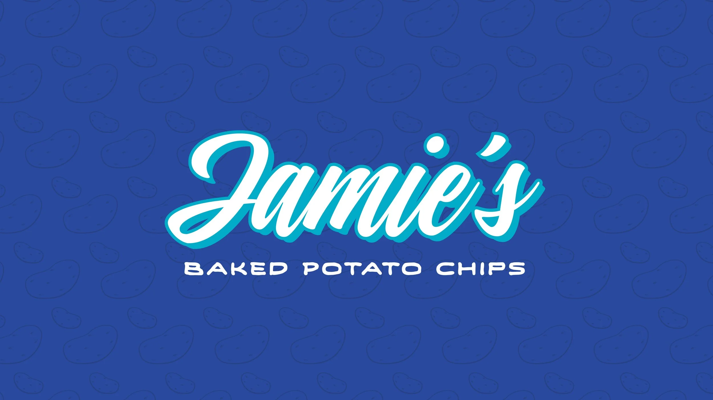
Jamie’s Baked Potato Chips
Packaging & Visual Identity
Create the packaging and identity for a healthy chip brand targeted toward Gen Z.
Brief
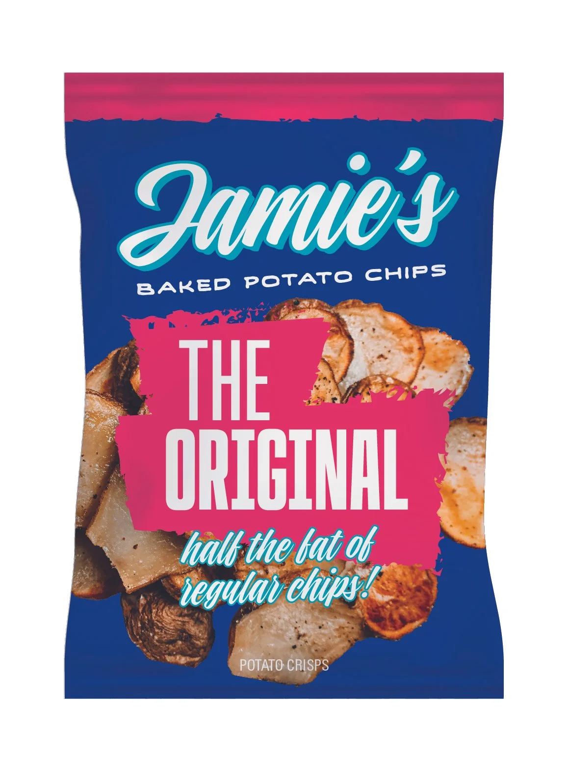
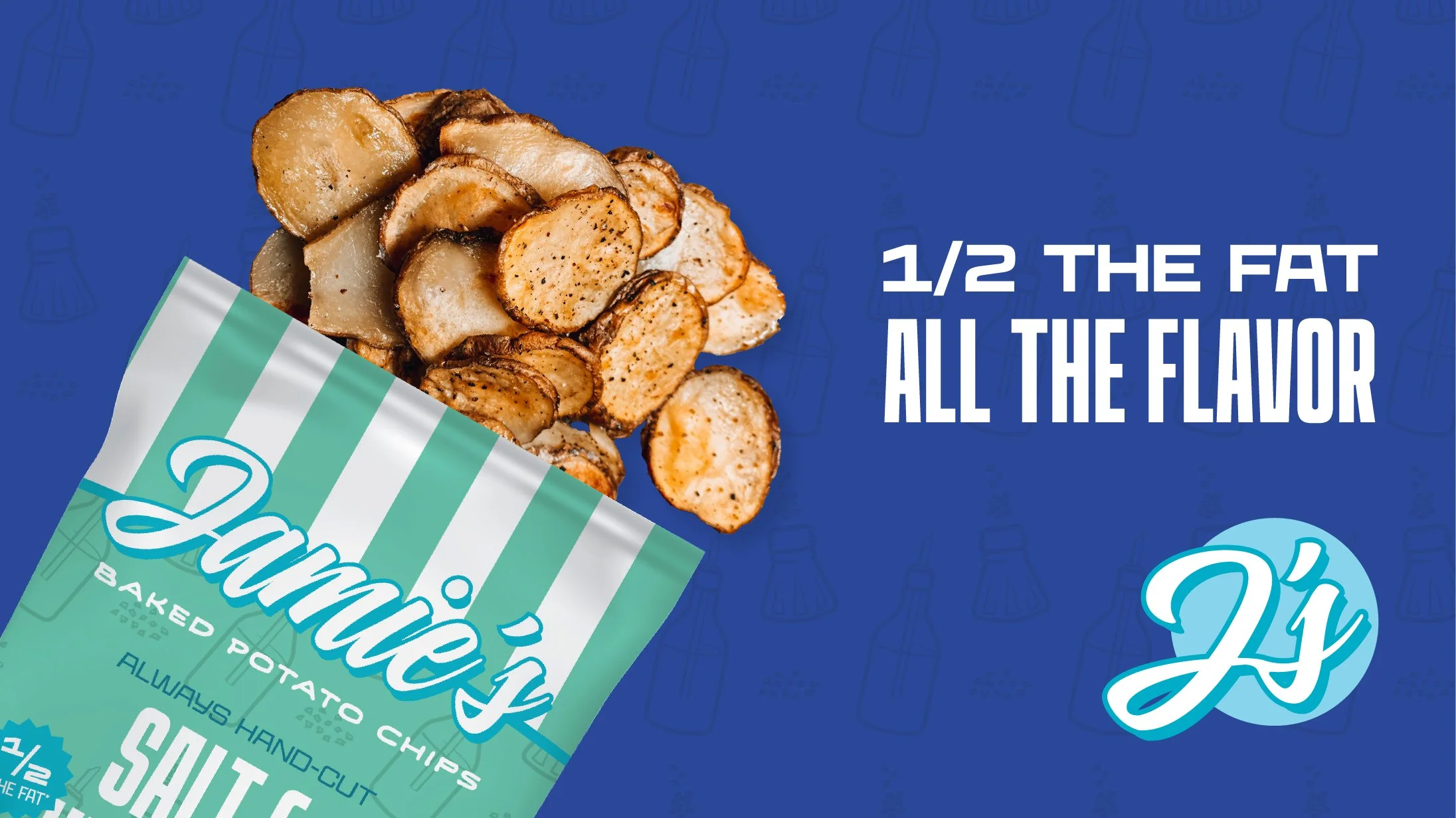
Jamie’s Baked Potato Chips is a new healthy chip brand inspired by deli shops and hand-painted signage. With bold colors and type, it hopes to disrupt the healthy snack category and appeal to a young audience.
Overview
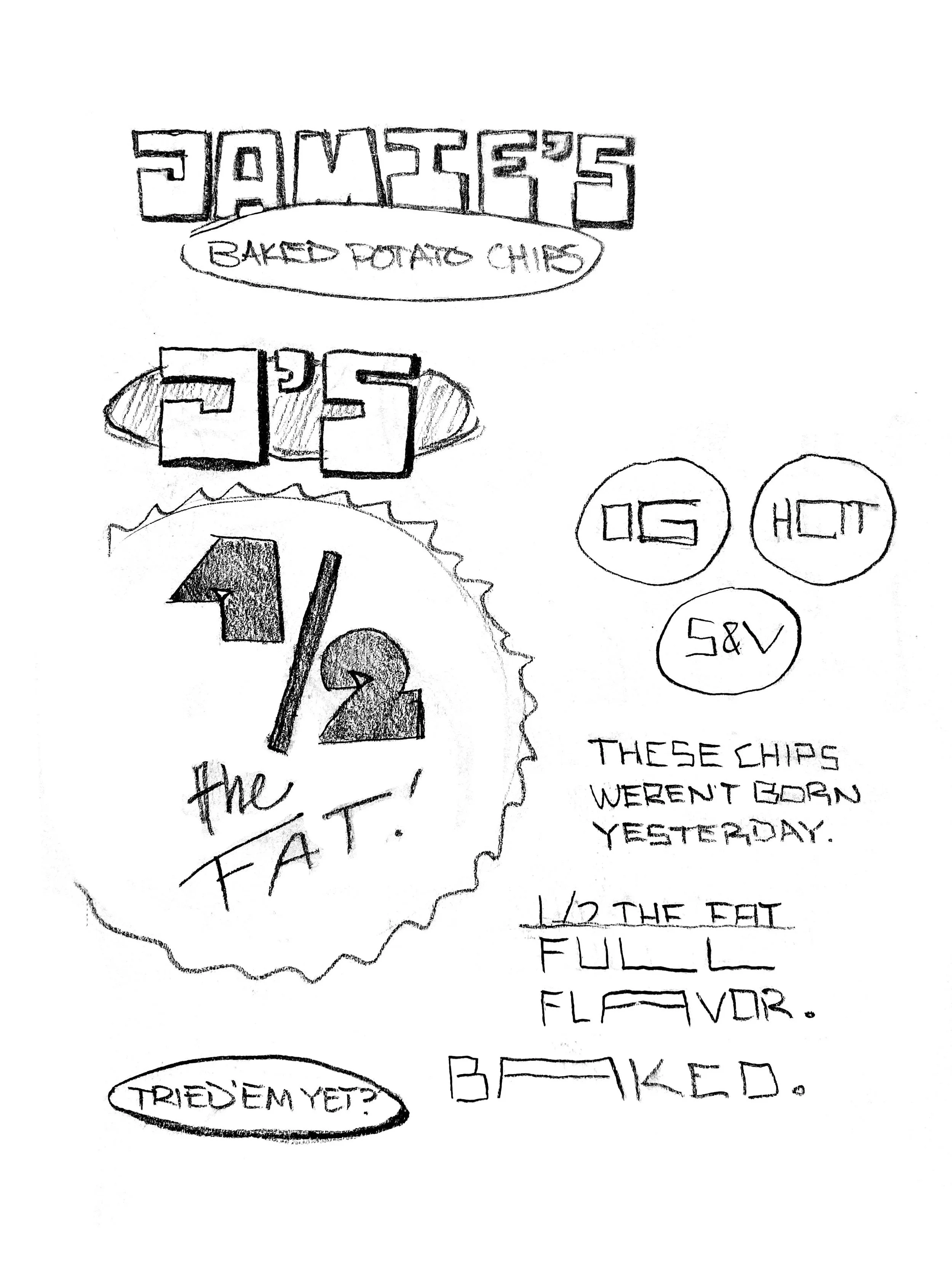
Sketches & Process
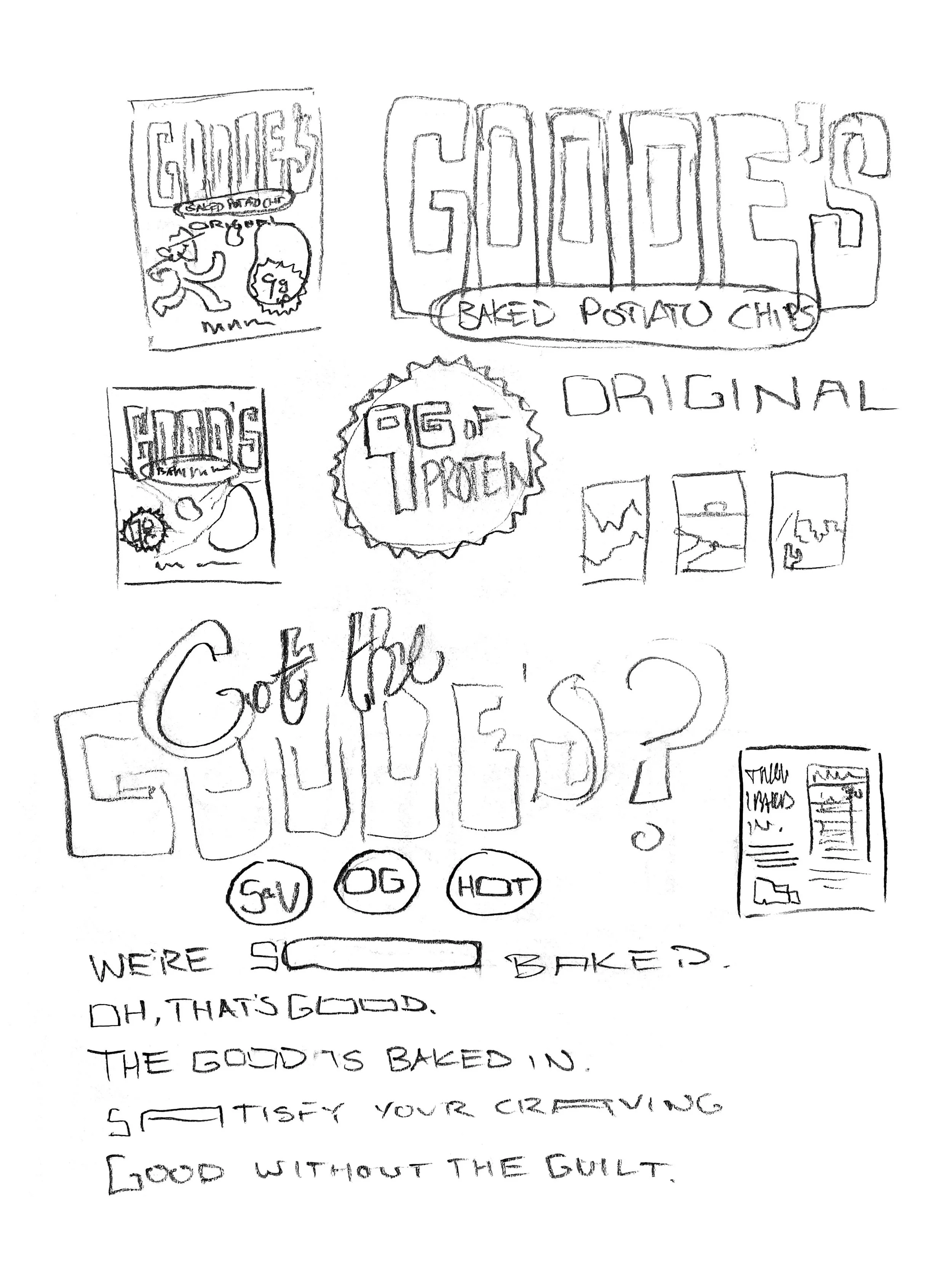
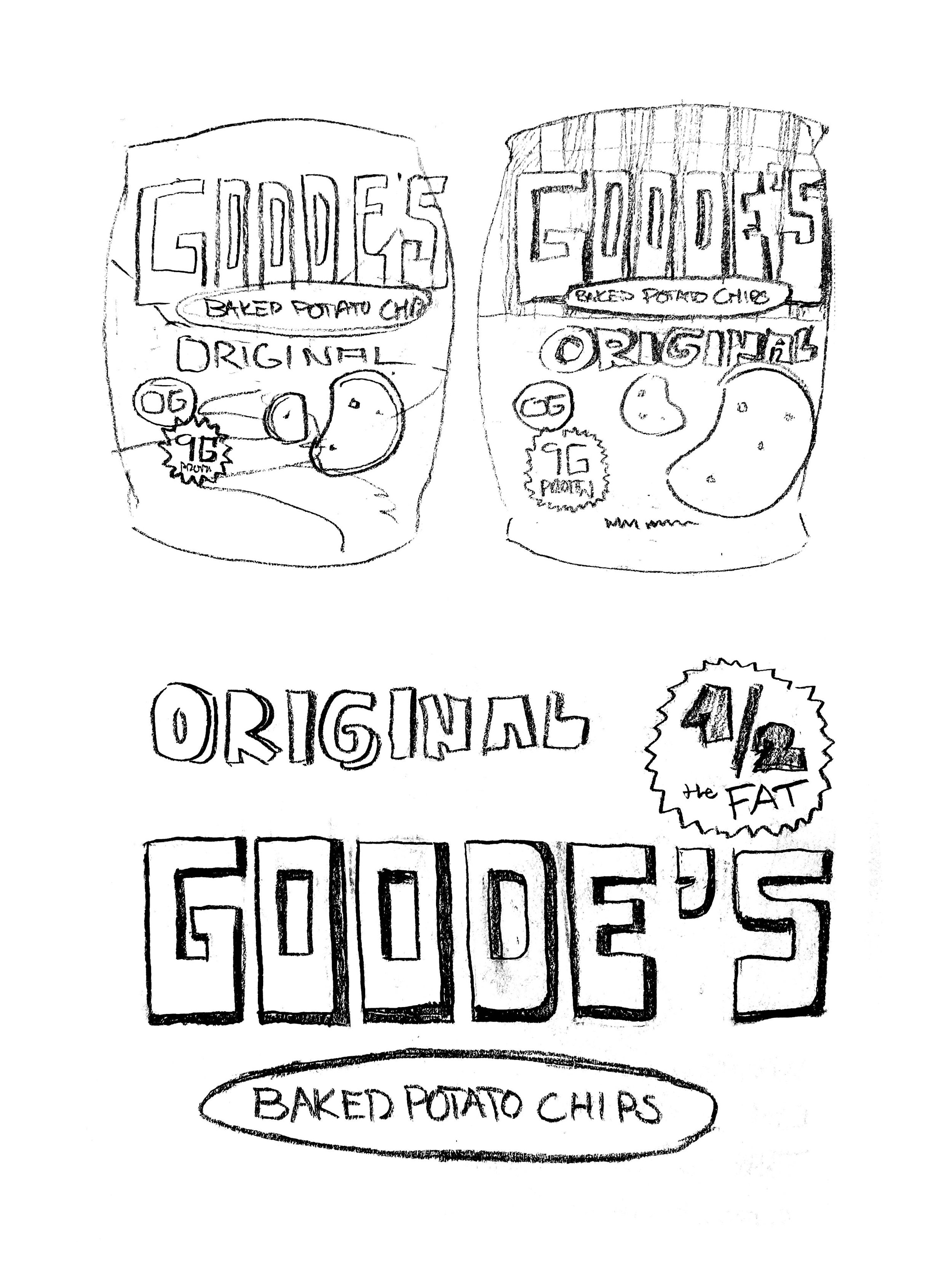
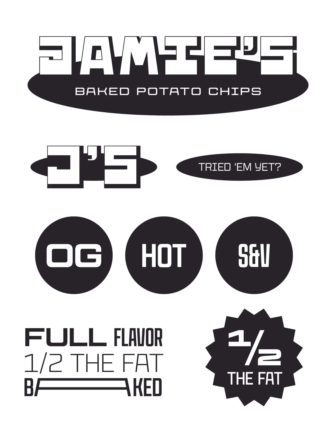
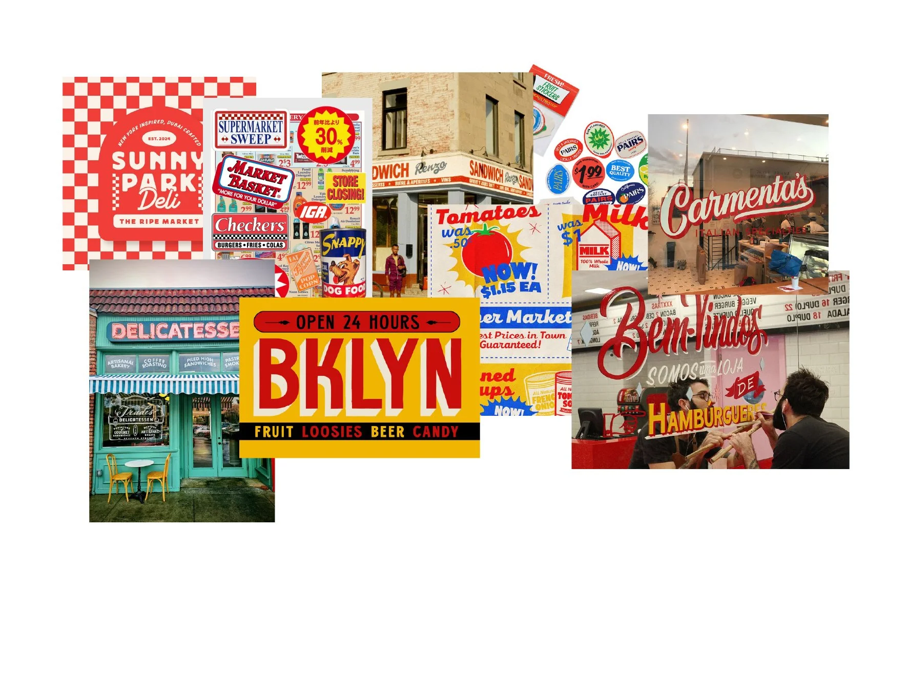
Package design explorations focused on standing out among other healthy snack competitors, focusing on the unique visual concept of a local deli.
Initial concepts took inspiration from the hand-painted typography seen in deli shop windows. The brand was named Jamie’s to bring a personal touch to the product.
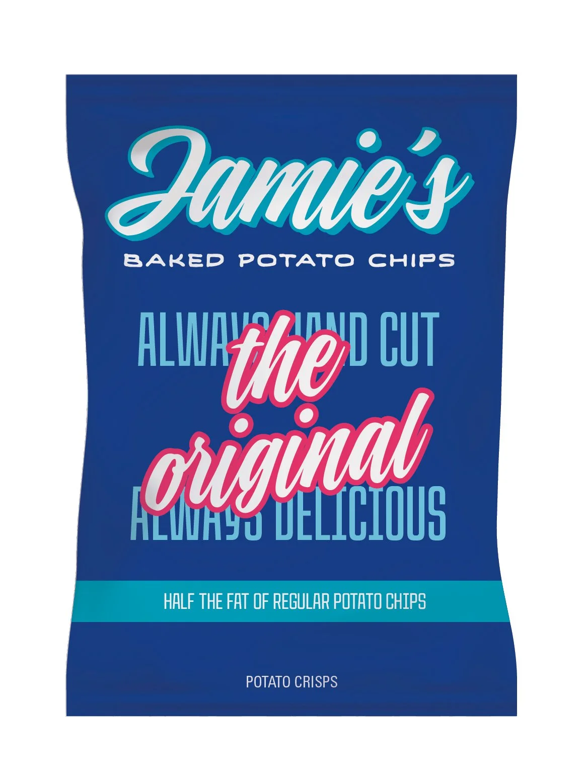
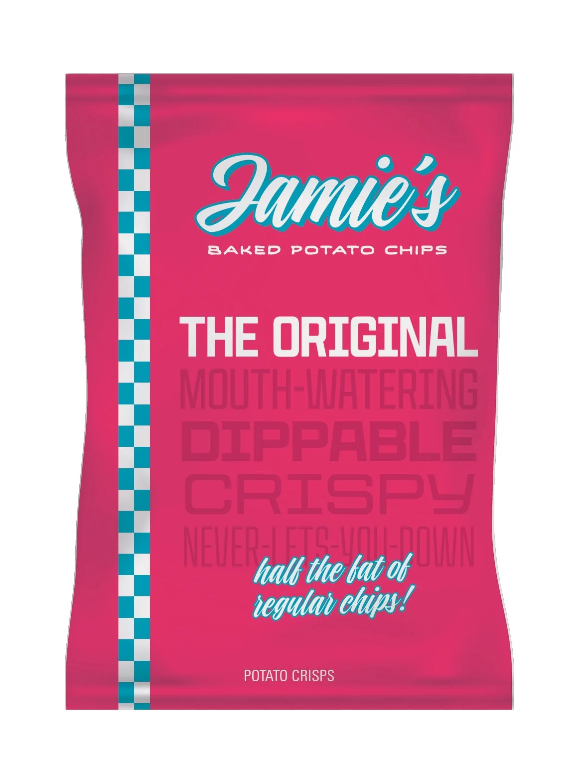
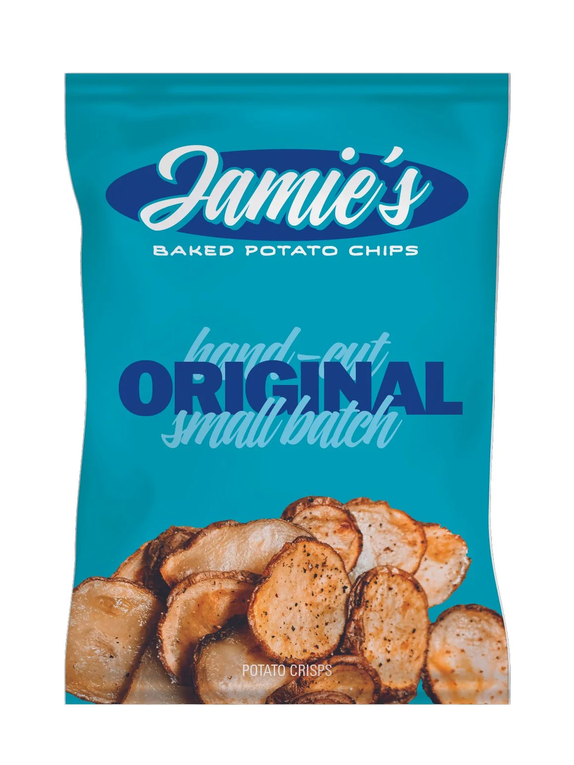
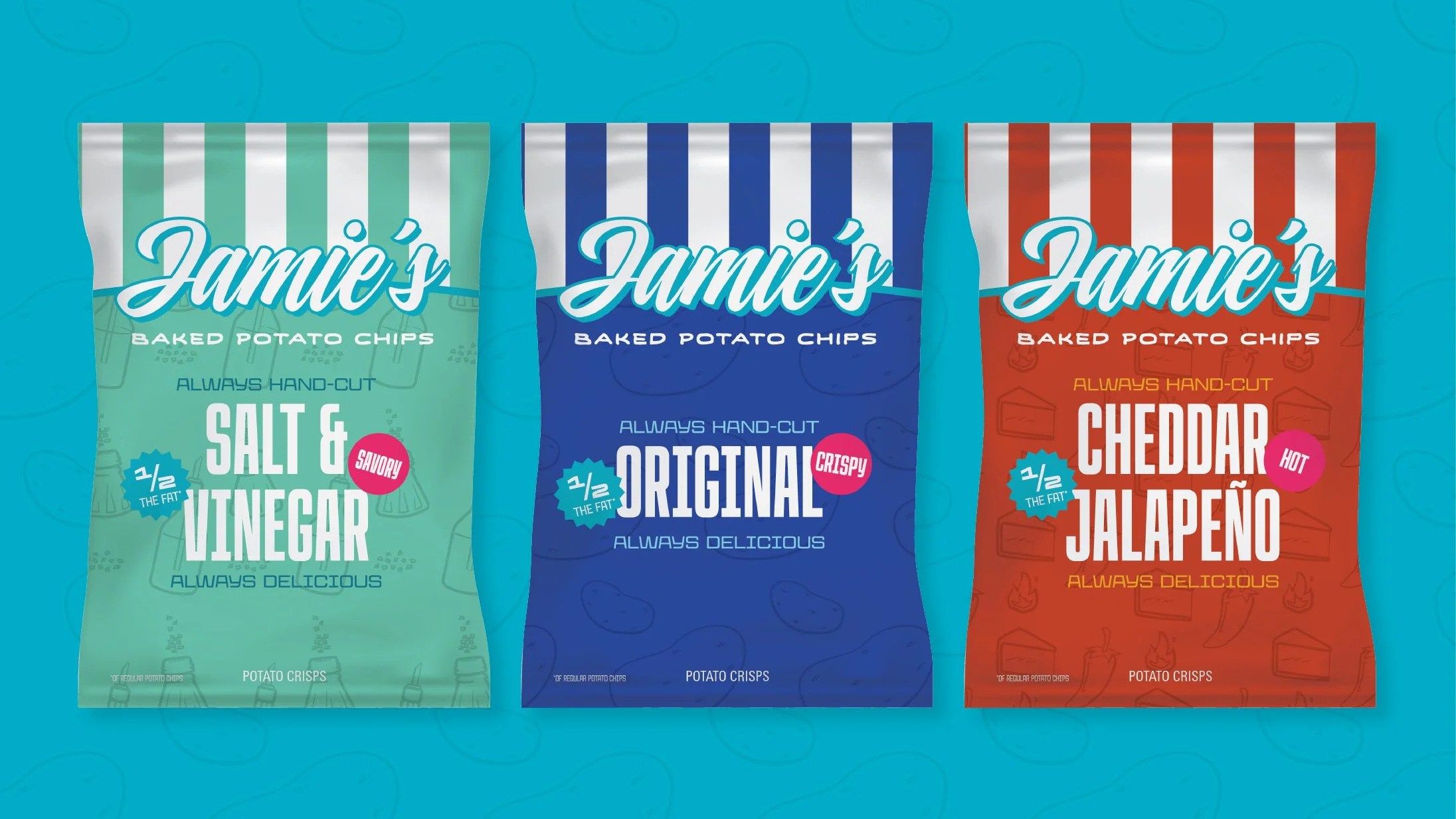
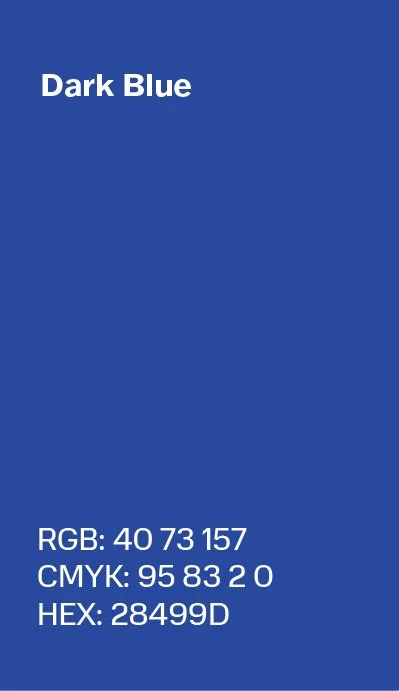
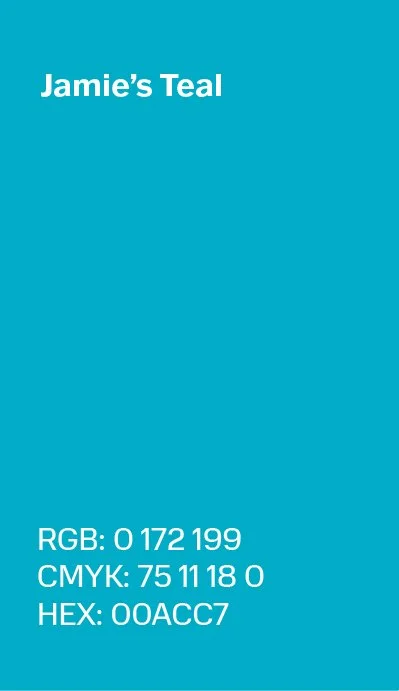
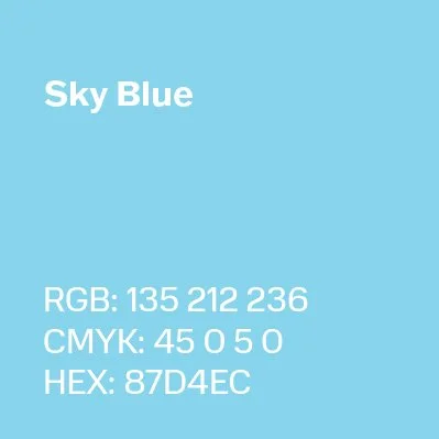
Final Visual Identity

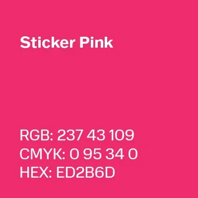
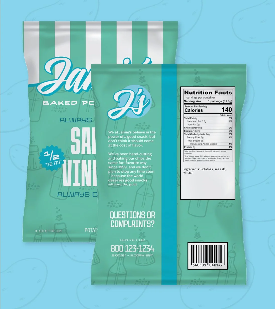

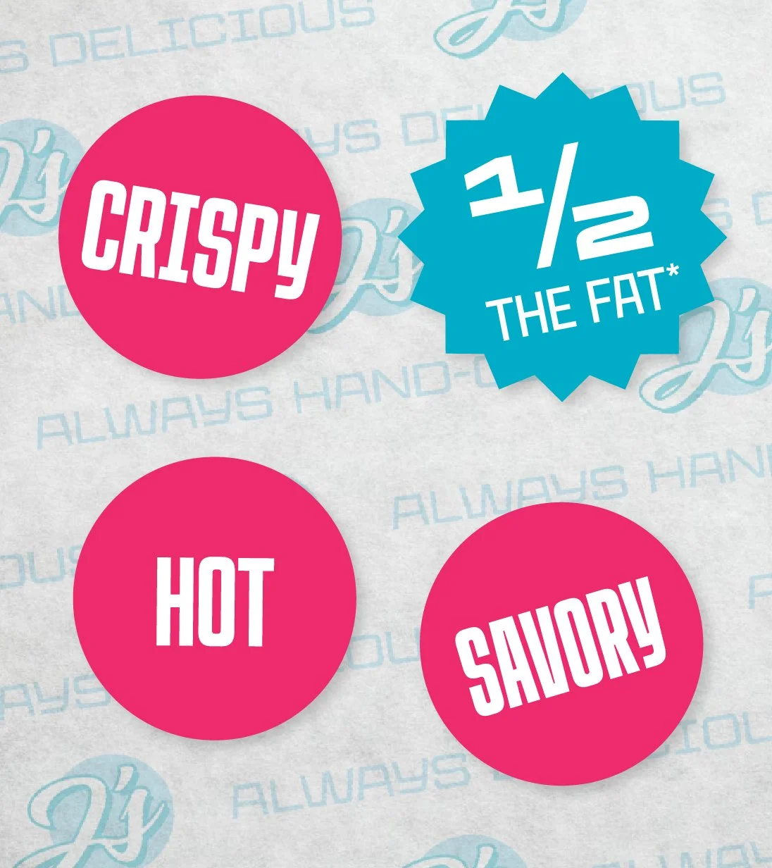
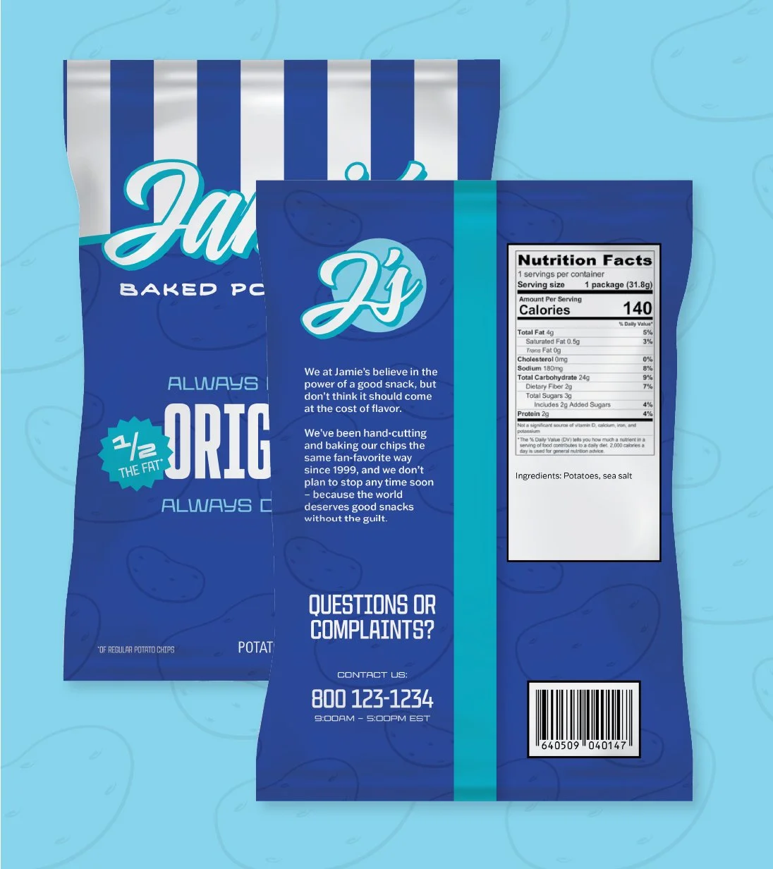
Design elements inspired by deli stickers add the brand’s unique personality and roots to its packaging.
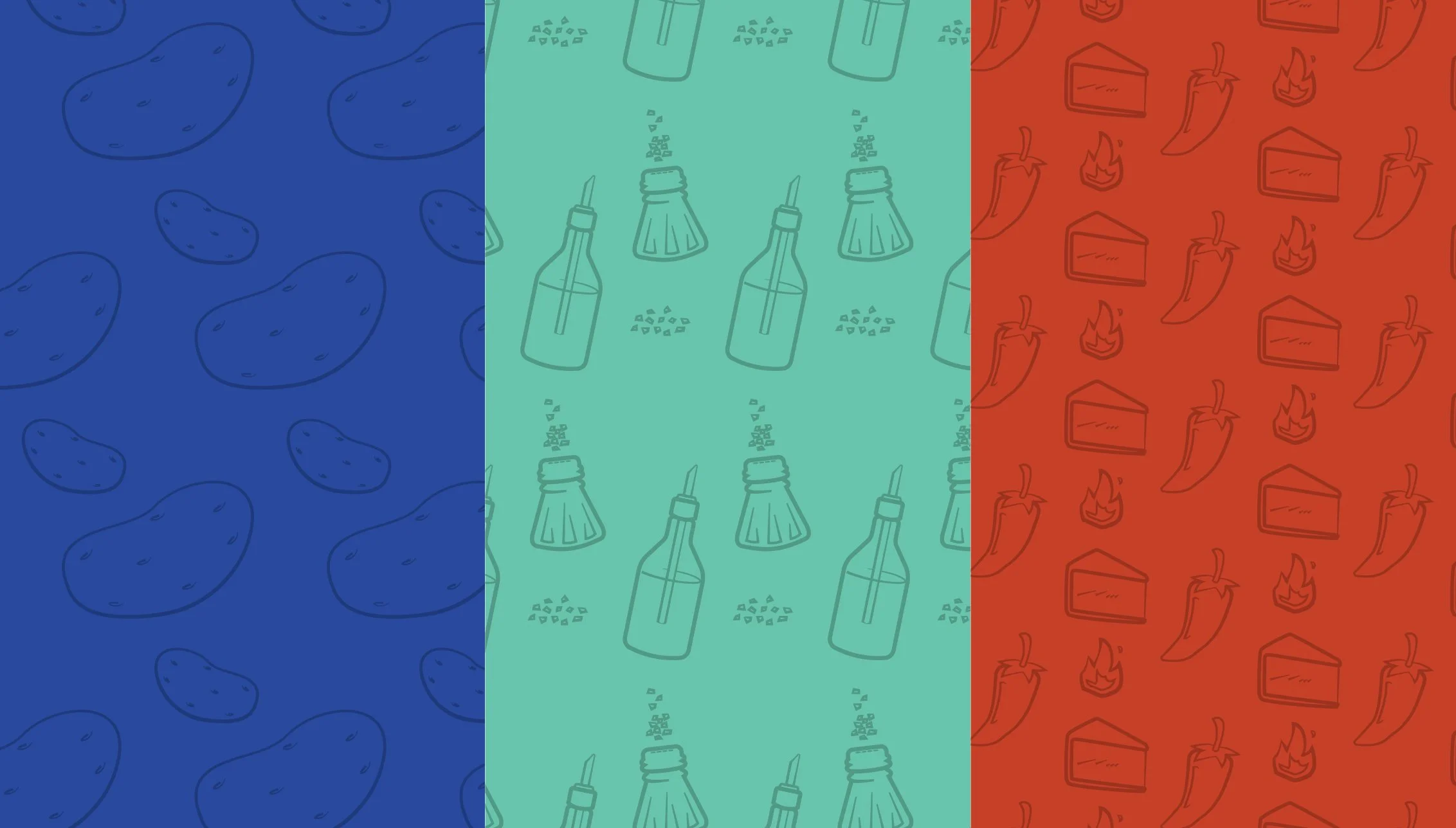
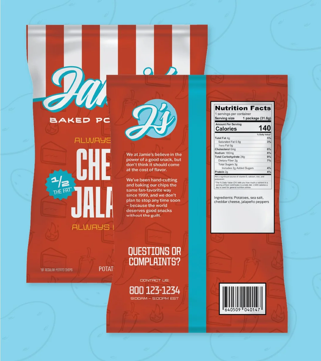
Illustrated patterns bring visual texture and differentiation to each flavor.